How to Print – Basic Instructions Canon Pixma
Basic Instructions for Printing Workflow
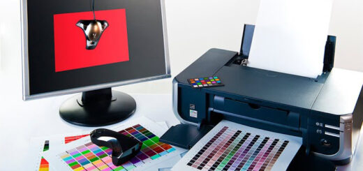
ICC output profiles characterize the colour gamut (range) for the combination of printer, ink and paper. By using colour management you can enable the optimum gamut transition from the monitor view (for example AdobeRGB), to the gamut your printer is able to print.
For: Epson | Canon Pixma | Canon iPF Printers
Please note: the output of the image will only be as good as the image itself.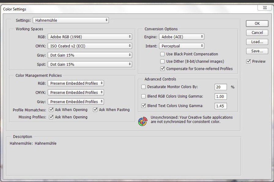
Colour Settings:
First, we will set up your Creative Suite colour settings. In order to do this you will need to open Photoshop. Go to Edit>Colour Settings. The above window will open. Make all of the necessary changes to match up to the example.
Once this is complete you will have the ability to open images to be printed in the appropriate colour space and view them closely to what the initial output will be when it is printed.
Now that the colour settings have been changed you can open up the file in Photoshop. You may get a window asking if you would like to keep your colour space the same as the file OR if you would like to convert it to Adobe RGB (1998). Click the radio button to convert it to Adobe RGB (1998) and open the file. If you do not get this window when you open the file that means it is already in the correct working colour space to move on to the next step.
The following pages will give a step-by-step tutorial on printing with a Canon Pixma Pro printer. In the example it is a driver for a Canon Pro-1 however the drivers for the most common Canon Pixma Pro printers have all of the same options.
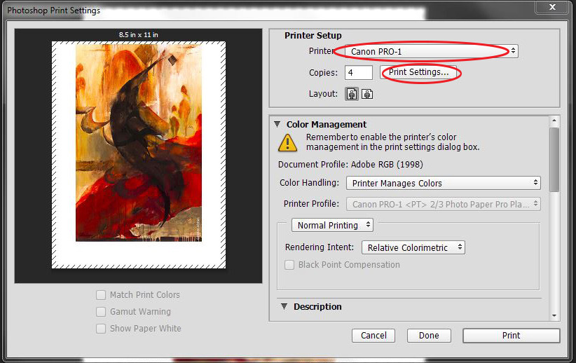
Once the file is opened and ready to print go to File>Print. The Photoshop print dialog window will open. This is where you will select the appropriate printer, in this case the Canon Pro-1.
Working your way from the top of the dialog box to the bottom is the easiest way to set up a file, so the next
thing we will work with is the Print Settings.
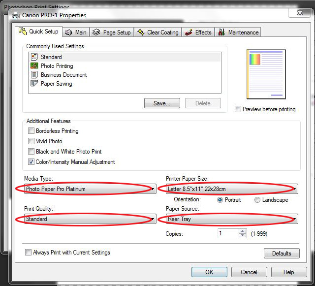
Your Print Settings dialog box will open. These are the settings that are specific to the chosen printer. The
main areas to be concerned with are the Media Type, Print Quality, Paper Source and Printer Paper Size.
For this example we will set the image up to print on William Turner.
Again, we will work from top to bottom in this area.
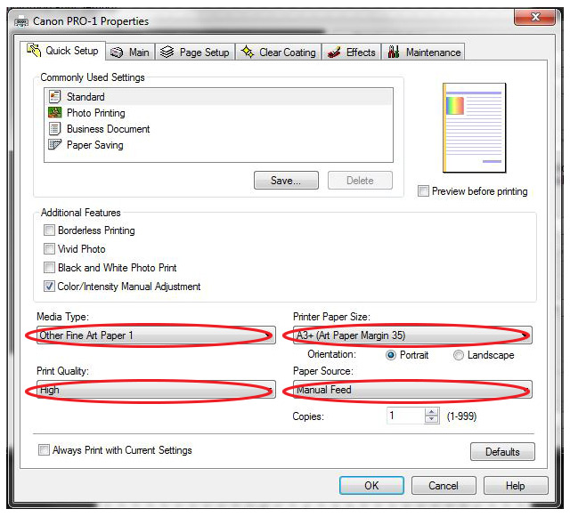
When you download the ICC profiles from our website a PDF file called Handling Instructions also downloads. This tells you the proper media setting and quality settings for a particular paper. In the case of William Turner it is “Other Fine Art Paper 1” on the Canon Pro-1. You will then set your Quality to “High” and set your paper size that you wish to print. The last selection on this window will be the paper source. On the Canon Pixma Pro Printers you should choose the “Manual Feed” if one is available.
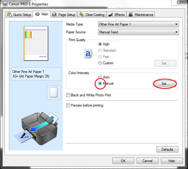
The final step in the Print Settings area is to turn off the printer’s colour management. On the Canon printers
this is not very intuitive. First you will go to the “Main” tab at the top and the above window will open. You will choose “Manual” for the “Colour/Intensity” and then Click “Set”.
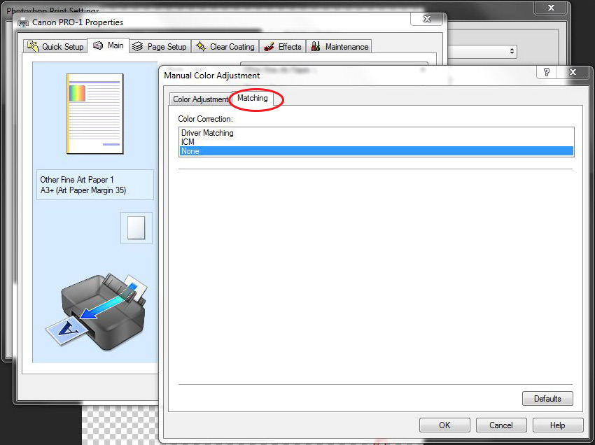
The above window will open after you have hit “Set”. You will now go to the “Matching” tab and select “None”.
Once this has been done you can now select “OK” to close out this window and then select “OK” again to get
back to your Photoshop print dialog box.
Now that all of the printer specific settings are complete we need to tell Photoshop exactly how to handle this
file and what information it should send to the printer.
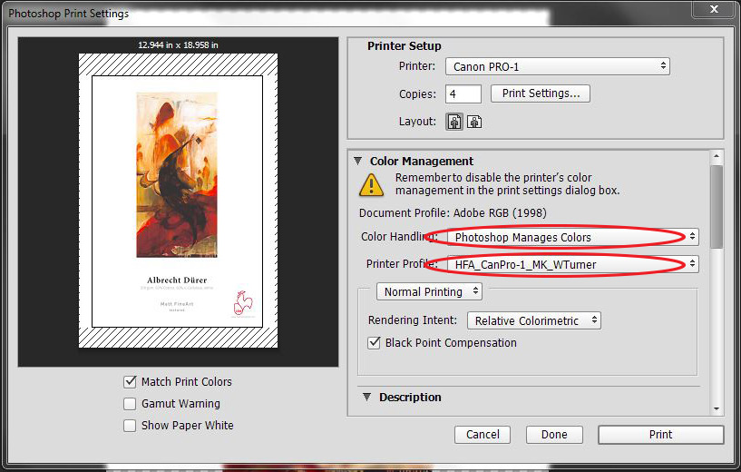
First, change the Colour Handling to “Photoshop Handles Colours” in the dropdown menu. There will be a
message asking to make sure you’ve turned it off in the print dialog box. This will appear even if you have it
turned off as a precaution, do not worry.
The next dropdown is where you finally choose your printer profile. The Hahnemühle profiles are all named by Range (HFA, HAR, HFAPhoto), then the printer model, the black ink to use (Photo or Matte) and then finally the name of the paper.
Here I’ve chosen the William Turner profile, which uses Matte Black ink, on the Canon Pro-1. William Turner is in the HFA Range.
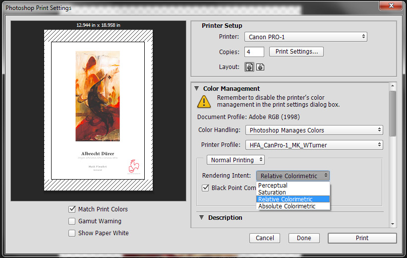
After choosing your profile you will need to pick the “Rendering Intent”. There are four available but with our
profiles you will only be working with two of them.
You can choose either Perceptual OR Relative Colourmetric. With Relative Colourmetric you can either have
Black Point Compensation on or off. This adjusts how some of the darker areas in the image will print. In
Perceptual, Black Point Compensation does absolutely nothing.
There is no “set-in-stone” way for anyone to tell you which rendering intent to use. It changes from image to
image based on the colours and relations of those colours. The only way to know is to test OR to soft proof with a calibrated monitor.
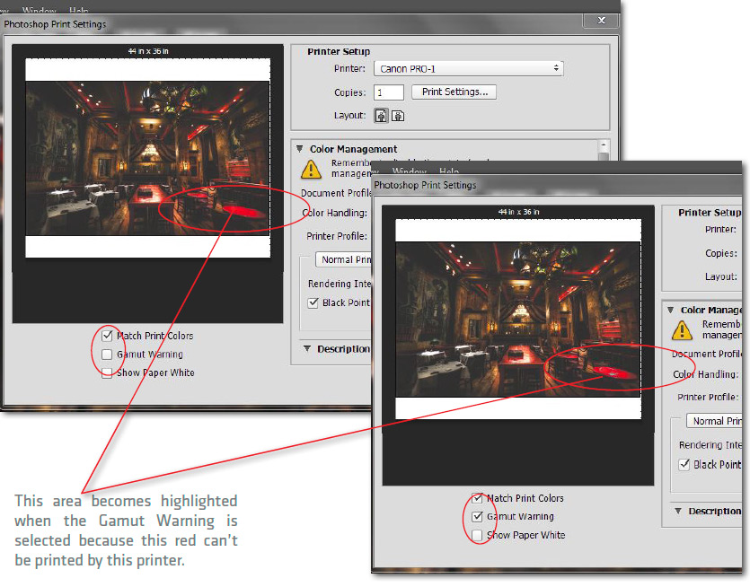
Before you print you can also check to see if any part of the image is outside of the Colour Gamut of the printer/ Profile directly from the Photoshop print dialog screen.
Once you have all settings made, select “Match Print Colours” below the thumbnail and then select “Gamut
Warning.” If any part of the image is outside of the colour range it will become highlighted in the thumbnail as in the example above.
Once you have chosen your rendering intent you are now ready to hit “Print”.
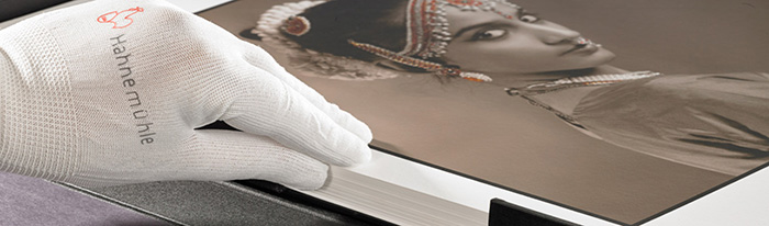
The preceding document was designed to give someone the basic knowledge to open a file and print it properly with good quality. There are many more adjustments that can be made to make the image look even better and there are more ways to do more accurate soft proofing. It is recommended that a colour calibrated monitor be used during these processes.
All ICC profiles and media handling instructions can be downloaded from: http://www.hahnemuehle.ca/icc-profile/